When NHL Seattle first installed signage on its downtown office in 2018, employees arrived at work the next morning to a surprise.
Stuck to the door was a Post-it note with a handwritten message: "Release the Kraken."
"That may have been the first time I heard or thought of 'Kraken,'" said Heidi Dettmer, the team's vice president of marketing. "But throughout this whole process, it's been a rallying cry for fans. We heard it everywhere. It's what kept coming up over and over again."
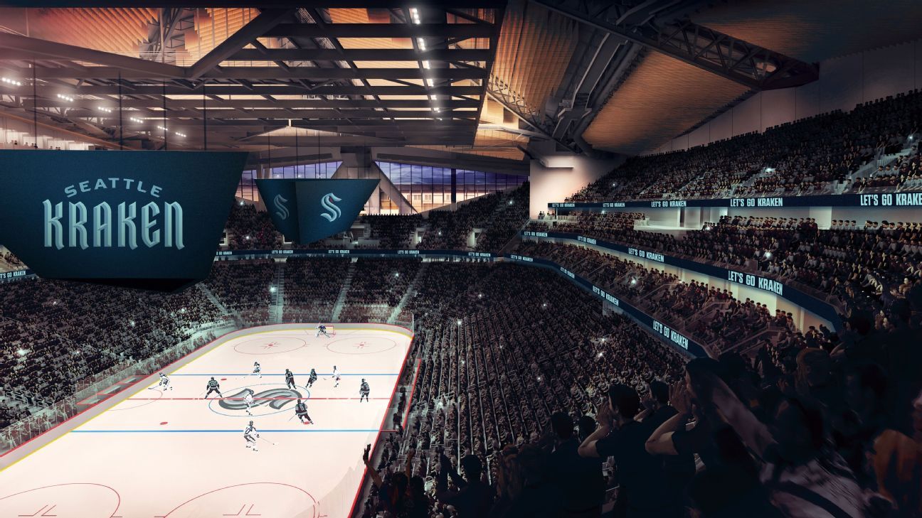
The NHL awarded Seattle an expansion franchise in 2018, and ever since, fans have obsessed over the name, color, logo and branding -- even though the team won't debut until the 2021-22 season. Since Seattle has had ample time, the process has been meticulous, but it also needed to be secretive (think shadow web domains, using a firm from Hawai'i to do domain registrations to throw off the scent and plenty of non-disclosure agreements).
"We were careful with where we met. We were careful with what material we printed. And when we had these meetings, we drew the shades with paranoia," said Amazon Web Services CEO Andy Jassy, a part-owner of the team.
Jassy said the team looked at over 1,200 names and did a "real exploration" on more than 100. The franchise settled on five finalists, which were sealed into an envelope and put in a time capsule in Seattle's Space Needle -- along with Nirvana records, a Twinkie and one share of Amazon -- that will be revealed in 2062, on the Needle's 100th anniversary.
For now, here's an exclusive peek into the process of how the Seattle Kraken -- and their color scheme of deep ocean and icy blues, plus "red alert" accents -- were released.
Choosing the name
Seattle considered the Metropolitans -- the name of the city's original pro hockey team, which won a Stanley Cup in 1917 -- though there was some pushback from the league. The NHL has the Metropolitan Division, and commissioner Gary Bettman didn't want to change it for the sake of the new franchise.
"That was one [the league office] expressed reticence on, for the reason mentioned," Jassy said. "But they were always very supportive; I thought they always gave good, honest feedback. They had some of their own ideas too. When Kraken was the leading name we were thinking about, and we sought input from them, they always liked that name a lot."
Team president Tod Leiweke is fixated on running a fan-driven franchise -- "The fans are going to be involved in every decision," he told ESPN in 2019 -- so the team launched an interactive portal in May 2019 where anyone could offer suggestions. Team leaders also would periodically sit with a group of fans, show them some markups and ask for feedback.
Dettmer said the team monitored a Seattle Times reader poll that garnered more than 146,144 votes. Though the Seattle Times' poll narrowed it down to Sockeyes and Totems as finalists, Kraken had a strong showing.
Most intriguing: Twitter stalking. If you opined about the Seattle team name on that platform sometime over the past two years, Seattle NHL probably read about it.
"We watched what was happening on social media -- how often potential names were mentioned, what was the sentiment, the reactions," Dettmer said. "That was pretty regular. We would have updates on a weekly cadence on that."
It's unclear who first suggested Kraken internally, though film producer Jerry Bruckheimer, another part-owner of the team, has used the mythical sea creature in his Pirates of the Caribbean movies. Fans latched on. So did Seattle's branding committee. Around Christmas 2019, the group was all but settled on it.
"It's a very unique and unusual name in sports, because almost all sport franchises end with an 's,'" Jassy said. "There are a lot of obvious connections to Seattle -- part because of our maritime history, part of because we have so much water around us -- but there is longtime folklore in Seattle and the Pacific Northwest of this mystical Kraken creature that lives just below the surface of the sea, which really captivated people for many years. That mystique, that intensity and that power that people have long talked about with the Kraken is what we expect our NHL team to play with."
Logo and colors
Team general manager Ron Francis was a member of the branding committee. According to Dettmer, "His opinion held a ton of weight in this process from a hockey standpoint." Francis offered one guiding principle: "This needs to be a sweater, that when the players put on, they feel really proud. It needs to be iconic. It needs to be noble."
Another key player: Adidas, the official uniform partner of the NHL. Adidas NHL director Nic Corbett and design director Matty Merrill recall going to a meeting at Bruckheimer's Los Angeles office about 18 months ago to pitch him on why they should have a seat at the table.
"A lot of people assume that when opportunities like Seattle come along, it's an obligation or a right for us to be involved because of our relationship with the NHL," Corbett said. "But we had to ask for it; we had to fight for it."
Bruckheimer invited Adidas to collaborate, and the company played a big role in shaping the logo and refining the colors. The broad strokes were easy to fill.
"During the discovery and listening period, we heard from fans loud and clear that they loved the colors blue and green," Dettmer said.
Seattle wanted to invoke the city's unique landscape -- the water, the trees, the mountains, the precipitation -- but also deviate from what was expected.
"We didn't feel like the colors had to be exactly the same as the other pro teams here," Jassy said. "I think it ended up being a good balance of things that are resonant in our environment but also reflective of the sport of hockey. It was something we thought just looked really attractive."
Of the NHL's 31 existing teams, 16 have some shade of blue in their logo, so Seattle's needed to be unique.
"People called it baby blue, people called it Columbia blue, people called it powdery blue, but it's not; it's actually quite brilliant, almost a neon blue that looks like the ice caps on the Olympics and the white caps on the Puget Sound," Merrill said. "Then the navy is so dark, it's almost black. We call it deep sea. The whole [home] uniform has no white, there's zero white, and it's really just these complementary blues. The way they present their brand will be that way -- these two blues, and no white, no surrender at all."
It's official! The #SeattleKraken are the newest members of the @NHL! #NHLSeattlehttps://t.co/y7oDkYk50j pic.twitter.com/TbqgudcjAy
— icethetics (@icethetics) July 23, 2020
For the logo, Merrill desperately wanted to avoid the Kraken becoming a caricature.
"We had to make sure it wasn't a cartoon character or something silly," Merrill said. "Also, it's the tradition of the sea; you don't mess around in the sea. If you mess around in the ocean, you get sucked in, and you die. It commands some seriousness, which we knew we had to hit."
And the last ingredient: mystery.
In one meeting, Leiweke said: "There's nothing more frightening than the theater and the mystery of the mind." Merrill's mental gears began spinning, thinking of Alfred Hitchcock movies in which you don't see the killer, but you know he's out there.
The "S" as the primary mark is an homage to the original Seattle Metropolitans uniforms.
"But while you're seeing the S, and thinking about the Metropolitans, thinking about the colors, that negative-space tentacle is hiding there, wrapping around your ankles, ready to pull you down," Merrill explained.
The logo was almost finished, but Merrill knew it needed something else. Then came the "aha" moment, provided by majority owner David Bonderman.
"Bonderman was like, 'You should put the eye right there,' and pointed to the top of the S," Merrill said. "I thought it was going to be terrible, actually. But we tried it, and it looks pretty good."
The designers always wanted to incorporate red in the palate -- to differentiate the Kraken from all the other blue teams in the NHL, and the other blue teams in Seattle.
"We wanted to represent the Kraken somehow," Merrill said. "Red represents danger; red represents threat. It was the perfect accent throughout."
The exact shade they chose? It's called "red alert."
Unleashing the Kraken
Since the process was so prolonged, the team was paranoid about leaks. Over the past few weeks, need-to-know staffers have used "Seattle Cascades" as a code word or have sometimes written "Seattle K" in emails. Dettmer maintains a spreadsheet of names of people working for NHL Seattle, agencies and Adidas employees, detailing what type of NDA they have signed and what level of access they had: Do they know the name? Have they seen the logo? Have they held the markups?
Seattle NHL filed three trademarks -- Kraken, Sockeyes and Breakers -- and registered five domain names -- Kraken Hockey, Sockeyes Hockey, Evergreen Hockey, Renegades and Seattle Renegades.com -- so they could use some as decoys. The team also worked with a company in Hawai'i to do some registration and consulted with a firm in London to deflect attention.
The final trademark was approved exactly a week ago, at which point they were ready to go full steam ahead.
A common way a name or logo leaks is through the production process; many a logo or uniform unveiling has been spoiled that way. Seattle didn't want to give the markups to vendors too soon and potentially have someone see it at a factory or shipping center. As a result, it will take some time to get official merchandise and jerseys on to fans.
For now, the team has launched a website selling shirts that read "Release the Kraken" -- with 100% of the net proceeds going to local nonprofits YouthCare, Community Passageways and the Urban League of Metropolitan Seattle. The team says that the goal of this is to help end youth homelessness and create positive pathways and opportunities for BIPOC (Black, Indigenous, people of color) youth in the region.
As for what's next for this team ... maybe a mascot?
"I don't know," Jassy said. "We haven't gotten to a mascot. We just got our name and colors. The mascot is a whole other level."


 Phone: (800) 737. 6040
 Fax: (800) 825 5558
 Website:
  Email:


