

I Dig Sports

HICKORY, N.C. FloSports and the zMAX CARS Tour are partnering for a unique collaboration that will elevate grassroots racing with a historic doubleheader event The Throwback Classic presented by FloRacing at the legendary Hickory Motor Speedway.
The Aug. 2 event will feature the biggest single night in pavement late model racing history with a record-breaking purse of more than $200,000.
The Throwback Classic presented by FloRacing boasts the richest purse ever for both CARS Tour divisions and the biggest late model stars on the national stage.
It will be the second event to feature a $50,000-to-win late model stock race and the first to pay $2,500 to start, while the Pro Late Model showdown will pay $30,000-to-win and $1,500 to start.
This payout is simply incredible for the series, driver, and teams, said Dale Earnhardt Jr., zMAX CARS Tour co-owner. Our goal is always to continue to grow the Series by putting as many eyes on it as possible. Our partnership with FloSports allows us to do just that. The Throwback Classic at Hickory has always been a special event for the CARS Tour. But with this announcement its now the biggest pavement short track event of the year, period.
HEBRON, Ohio The International Hot Rod Assn has finalized the purchase of another first-class drag racing facility with National Trail Raceway.
The track located in suburban Columbus, Ohio, has a rich history, first opened in 1964, and now a bright future with todays announcement.
National Trail Raceway features a quarter-mile drag strip, which had its concrete ground just last week, and upgraded bleachers to make it more comfortable for spectators. Other amenities include a great variety of foods at concessions along with official merchandise at the National Trail Raceway (Pro Shop).
The IHRA is great. I think (IHRA owner) Darryl Cuttell is taking it to the glory days and making it bigger and better than ever, said NTRs Jay Livingston who is staying on as team manager.
National Trail Raceway is capable of hosting national events as well as being home to a strong bracket racing program. Its part of the appeal of the IHRA and its commitment to grassroots, Sportsman racing.
The racers have talked about IHRAs recent announcements of all-time membership coverages and significant purse increases to the IHRA Summit Team Finals and IHRA Summit SuperSeries World Finals.
Weve already had a number of racers reach out to us, Livingston said. They have gone out and looked at the IHRA Team Finals held at Quaker (City Motorsports Park) and theyre excited. Theyre really excited about the IHRA World Finals in Alabama that pays $25,000 to win.

BRISTOL, Tenn. How unusual would it be for two different Joe Gibbs Racing drivers to fashion three-race winning streaks in the first nine events of the 2025 NASCAR Cup Series season?
It could happen.
Denny Hamlin, fresh from consecutive victories at Martinsville Speedway and Darlington Raceway, goes for a third straight win in Sundays Food City 500 at Bristol Motor Speedway.
With a victory, Hamlin would match the feat achieved by teammate Christopher Bell in the second, third and fourth races of the season, at Atlanta Motor Speedway, Circuit of The Americas and Phoenix Raceway.
Last season, the spring race at the 0.533-mile short track returned to the concrete surface after three years on dirt. Hamlin won for the third time in the last eight races at Bristol and fourth time overall, second only to Kyle Busch (eight wins) among full-time active drivers.
The rate of tire fall-off in last years event took all the competitors by surprise and played into the hands of Hamlin, an acknowledged master of tire management.
However, the driver of the No. 11 Joe Gibbs Racing Toyota believes Sundays race is more likely to mirror last falls Bristol Night Race, won by Kyle Larson.
I think that was just kind of an anomaly, Hamlin said of last years Food City 500. We thought it was temperature, we thought it was all kinds of different things, but truthfully, theres something that was different.
Dont know really what it was, but I would expect that we would have the normal Bristol (this year), where your tires dont wear that much, if its the same tire. Temperatures look to be up, so I would say that we would have kind of the normal Bristol that weve had most of the time.
Hamlin will have a formidable challenger in Larson, who is going for a triple of his own. Larson is competing in Fridays NASCAR CRAFTSMAN Truck Series race, Saturdays NASCAR Xfinity Series event and Sundays Cup race, hoping to sweep the weekend, a feat achieved by Busch twice at Bristol, in 2010 and 2017.
No other driver has ever won all three national series races at the same track on the same weekend, though Larson came close three weeks ago at Homestead-Miami Speedway, winning the Truck and Cup races but losing the Xfinity race on a late restart.
No doubt Busch will be paying close attention to Larsons effort, as he was at Homestead.
He just tried it at Homestead an came awfully close, Busch said. Barring a restart late in the going, he had it. Thats what happens with the triples, man. There are so many variables that can come down to whether you get it or not.
If somebody can beat Larson off of pit road on the final run of the Cup race and he cant pass them, thats what happens in that one. But Im sure hell go and do well, and so be it.
The bottom lane of the track will be sprayed with PJ1 Trackbite for all three races this weekend, a departure from the resin used last spring.
I think thats been the most consistent thing that weve done, said Chris Buescher, who won the Night Race in 2022. The majority of time its been three or four feet of PJ1 on the bottom.
Interestingly, Buescher is the only Bristol winner in the last eight races to win from a starting position outside the top five. The Roush Fenway Keselowski driver won from 20th on the grid.
Weve been really good at Bristol, Buescher said. Weve had good pace. Our team, (crew chief) Scott Graves and our whole group have made great strategy calls to find some track position and be able to make some big gains in that sense.
Weve had race cars that have run the bottom really well when (other cars) have gotten strung out on the top, and weve been able to pass a lot of cars that way.
Buescher is the exception that proves the rule, but if qualifying position remains a decisive factor, that argues for Hamlin, too. He leads all active drivers with four pole positions at Thunder Valley.
Busch has two poles to his credit. No other full-time active driver has more than one.
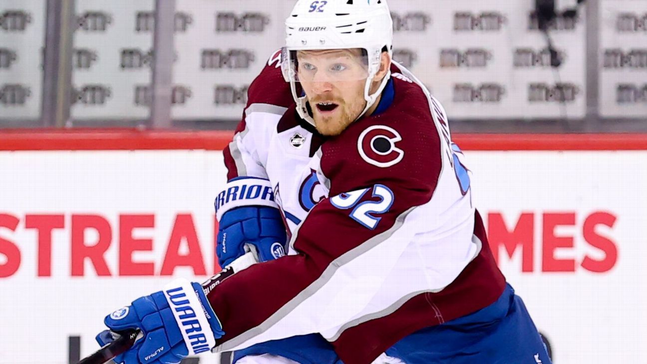
Colorado Avalanche captain Gabriel Landeskog will play Friday for the franchise's AHL affiliate, for his first professional game in nearly three years.
The Avalanche's AHL team, the Colorado Eagles, announced after morning skate that Landeskog would play in their game against the Henderson Silver Knights, the AHL affiliate for the Vegas Golden Knights.
On Wednesday, the Avalanche sent Landeskog to the Eagles for a conditioning stint. Landeskog has spent the past few days with the Eagles, who play a little more than an hour away in Loveland, Colorado, in an attempt to be ready for the club's bid to win its fourth Stanley Cup.
Landeskog's last appearance came in Game 6 of the 2022 Stanley Cup Final. He led the Avalanche to the third championship in club history. He would then miss the entire 2022-23 season with a knee injury and then underwent knee cartilage replacement surgery in May 2023. Landeskog would then miss the entire 2023-24 season.
The 32-year-old had been traveling with the team in recent years and had been doing on-ice work away from the team. This season, however, has led to Landeskog gradually spending more practice time with the Avalanche which further added to the belief that he could be part of their playoff plans.
Avs coach Jared Bednar told reporters after practice Friday that they will monitor Landeskog's progress and that there are no plans beyond him playing against the Silver Knights. Should the Avs want an extended look at Landeskog, they would have that option considering the Eagles have four more games before their regular season ends next Saturday.
Getting Landeskog back in the playoffs would potentially provide the Avalanche not only with their captain but a two-way winger who gives them another top-six and/or top-nine option depending upon how they use him.
Entering Friday, the Avalanche (48-28-4) were third in the Central Division standings with two road games remaining against the Los Angeles Kings on Saturday before finishing the regular season on Sunday against the Anaheim Ducks.

Gotham FC and United States women's national team winger Midge Purce is in line to return from a year-long injury absence in Sunday's NWSL clash with the North Carolina Courage.
Purce, 29, missed the majority of the 2024 NWSL season and the USWNT's gold-medal winning Olympic campaign after suffering a torn anterior cruciate ligament against the Portland Thorns on March 24 of last year.
But Gotham coach Juan Carlos Amorós revealed Friday that she will be able to return in some capacity this weekend.
"Very happy that after 13 months Midge is going to be available for selection, if nothing happens between now and the game," he told a news conference. "It's first credit to herself, to everyone that she's been working with here -- the whole medical team and all the coaches -- and especially to herself and her teammates, they've been outstanding.
"It's been a very long road since that injury happened last year in Portland. She's worked extremely hard to get to this point. Obviously it's the first game in a very long time so she probably wont play an amazing amount of minutes. But the fact that she's back in -- for herself first and foremost, but for everyone -- it's exciting news.
.@100purcent is back, and she's not here for small talk.
Get ready for a Sunday showdown against @TheNCCourage at @SI_Stadium pic.twitter.com/QzzcvezcT0
Gotham FC (@GothamFC) April 11, 2025
"We really recognize how hard she's worked, and how she's kept that positive mentality around everyone. Very, very excited to have Midge back in the team, she's a very special person and a very special player."
Gotham later posted on social media that "Midge is back."
Purce was named MVP of the 2023 National Women's Soccer League Championship after she assisted on both goals in Gotham's 2-1 victory over Seattle Reign FC. She has made 30 appearances and scored four goals for the USWNT in a variety of roles as a winger and a fullback.
Purce signed a new one-year contract with Gotham in February after she had entered free agency following the expiration of her previous deal.

MIAMI -- The United States will open the Concacaf Gold Cup against Trinidad and Tobago on June 15 at San Jose, California, play Saudi Arabia four days later at Austin, Texas, and close first-round play in Group D against Haiti on June 22 at Arlington, Texas.
Concacaf announced the match schedule on Friday, a day after the draw.
The U.S. has won its group in 16 of 17 Gold Cups, along with a second-place finish to Panama in 2011. Its group stage record is 40 wins, one loss and five draws.
These will be the last competitive matches for U.S. coach Mauricio Pochettino's team before its World Cup opener on June 12, 2026.
Sending a second-string team for the second straight Gold Cup, the U.S. lost a 2023 semifinal to Panama on penalty kicks.
Defending Gold Cup champion Mexico will play the opener of the biennial championship of North and Central America and Caribbean against the Dominican Republic on June 14 at Inglewood, California, meet Suriname four days later at Arlington and close its Group A play against Costa Rica on June 22 at Las Vegas.
Canada will start Group B against Honduras on June 17 at Vancouver, British Columbia, play Curaçao four days later at Houston and close the first round against El Salvador on June 24 at Houston.
Panama will begin Group C against Guadeloupe on June 16 at Carson, California, face Guatemala four days later at Austin and close the first round against Jamaica on June 24 at Austin.
The tournament will be played at the same time as the FIFA Club World Cup, which has been given priority for players by FIFA. Gold Cup matches will be played at 14 stadiums in 11 areas, avoiding the Eastern seaboard.
Mexico has won nine Gold Cups and the U.S. seven. Canada won in 2000.
Star exits, coaching changes, lawsuits: After awful 2024, San Diego is rebounding

Still reassessing and rebuilding the remnants left from a stormy 2024, new San Diego Wave coach Jonas Eidevall was honest after suffering his first loss in the NWSL.
"Like I said before the season, I think we need to have a really developing mentality. We need to grow stronger every week physically, technically, mentally, and this is no exception to that," Eidevall told ESPN following a 2-1 away defeat against defending champions Orlando Pride on Mar. 29.
"We know that: that's the story, that's the journey of our season here. We have lots of things left to develop, to grow and mature into, that's natural for us where we are at."
Hired in January, the former Arsenal coach is one of many fresh faces who have stepped into the organization that is seeking to move beyond the nightmares of the previous campaign. On and off the field, last year was a disaster for the 2023 NWSL Shield winners that were once one of the vanguards of the league. Through a rebuild with new owners, staff, and players, San Diego are hoping to leave behind the rocky waters of 2024 and find familiar sunny skies in a new spring.
And despite that latest loss on the pitch, there is reason to feel optimism.
To the credit of Eidevall and his squad, it was easy to spot a number of silver linings from the latest narrow defeat that featured a majority of the possession, a clear style of play, and standout moments for promising young players. Coupled with a win and draw in their two previous matches to kick off 2025, the Wave appear to be on the cusp of a turnaround. Nevertheless, it's far too early to make assumptions about how things will go for the team after just 270+ minutes of play.
With plenty still to prove on the pitch and beyond, can San Diego get back on track?
"It was a tough year for the club, there's no kind of sugar coating that," sporting director and general manager Camille Ashton told ESPN about 2024. "This is a club that has always had a lot of ambition and expectations to do well and be successful."
Months after finishing at the top of the table in 2023, San Diego endured a disastrous season that involved three different managers (Casey Stoney, Paul Buckle, Landon Donovan) and a 10th-place finish, which left them outside the playoff picture. Key figures and U.S. women's national team stars such as Naomi Girma and Jaedyn Shaw headed for the exits, eventually leaving the club (for Chelsea and North Carolina Courage respectively) after the conclusion of 2024.
"On the field, that's always tough to get out there and cheer all the time, to get as excited as you want to be when the team isn't coming through the way that you're trying to will them to be," said Sean Dreusike, a member of the Sirens supporters group.
Behind the scenes, the team also made negative headlines after former employees sued the club and the NWSL, citing allegations of discrimination, sexual harassment, retaliation, and wrongful termination. The suit followed accusations in the summer that president Jill Ellis, who has since left after being hired by FIFA, had led a toxic workplace environment.
By January, a sixth former employee also joined the lawsuit, alleging sexual harassment by a male supervisor at the time.
"The off field stuff, being a fan, leaves questions that need to be answered by the team and fans are some of the right people along with media and whatnot to ask those questions and try to get either answers or change," said Dreusike. The Sirens released a statement in October in which the group announced they "no longer trust the front office's decision-making nor do we believe in the current leadership's ability to oversee the positive changes that are desperately needed."
As part of broader front office alterations, Ellis' December exit marked a significant pivot in direction for the Wave, as did the completed purchase of the club late last year by the Levine Leichtman family.
Looking back on the pitch, Ashton, who was hired last summer, was tasked with rebuilding the squad that not only had Girma and Shaw soon heading out the door, but also superstar Alex Morgan hanging up her boots in September.
"When you're new in an environment, you want to be able to not take too much time, but take time to really understand where things are at, evaluate how things are working, where there are development areas, what are the things that are most important to sort of tackle, and take a little bit of time to digest all of that before you start to implement and make changes," said Ashton.
"We had a very busy off season."
The first major step of business? Bringing in Eidevall. According to Ashton, the Swedish coach won over the Wave due to his tactical knowledge, ability to win titles, experience in a high-pressure league in England, know-how with building teams, and ambition. Importantly, there was a sense he could translate those skills into the NWSL and create sustainability with the Wave.
For goalkeeper and captain Kailen Sheridan, the hiring of Eidevall and his staff was the most vital piece of the team's new puzzle for 2025.
"The coaching change is going to be huge," Sheridan told ESPN during the preseason when asked which modification at the club will be the most impactful. "It's a complete new staff, which kind of is an opportunity to start over. Obviously, players is massive as well, but with the coaching change, that's a whole tactical change."
"If we had some staff that stayed with us [from 2024], the players obviously would be a big difference. They would have to come in and adapt to the style. But now we're starting with a new style, so it's an opportunity for the staff to kind of make their mark, and the players to learn and to grow together."
Part of that process has also meant reinforcing the roster. Along with a list of intriguing up-and-coming names, ownership hasn't wasted time with the incorporation of noteworthy figures like France international Kenza Dali, Canada international Adriana Leon, and Colombia international Daniela Arias.
Another key aspect of Eidevall in this rebuild is his ability to influence the players with a move to San Diego. Dali, recently with Aston Villa, wasn't sure at first if she wanted to leave England, but was swayed after a conversation with the coach.
"I had a call with Jonas. I know Jonas, I played against him a lot," Dali told ESPN. "I know what he is trying to do in terms of football, and that's what really attracted me is the way he plays, his philosophy. That was [what] convinced me."
With reinforcements in tow and new players from last season stepping up, the change in the starting XI from the season openers in 2024 and 2025 was a dramatic one. Of the XI that took the field for last season's first game, only three returned to the starting lineup for 2025's opener.
Looking back at the old formation, it's impossible to miss marquee stars and leaders such as Girma and Morgan. And while it's near-impossible to replace what some of those names represented beyond the confines of Snapdragon Stadium, the Wave's latest additions have notably boosted the team this season.
"Those players [who left] obviously leave their mark and I think they're the type of players where you feel when they're gone," midfielder Makenzy Robbe told ESPN. "But I think at the same time we've really been able to kind of keep the intensity and the standard high."
It's a small sample size, but the underlying numbers look decent for the team that has kicked the season off with a 1W-1D-1L record that has included just one match at home. With the aim of dominating the ball and building out from the back, the team has averaged 57.3% possession per game, creating 18 chances along the way, scoring five times, and accumulating a total xG of 3.59. When regaining the ball, they're currently averaging a success rate of 56% in tackles.
Against Orlando, in what Eidevall claimed to be his biggest challenge to date with the team, there was much to like from the squad that was at first able to keep the title-holders silent. Through a high press and using possession as the best form of defense, the Wave appeared ready to snap Orlando's 21-game unbeaten streak at home.
"There [are] a lot of things in our performance we can be pleased with and I think we can be a little bit angry and irritated that we don't get any points away with us from this game," said Eidevall post-game.
By the second half, Orlando figured out the San Diego press and were given a lifeline through a goal in the 50th minute from Haley McCutcheon off a corner. Although youthful substitutions helped level things out for the Wave, with a goal from 19-year-old Chiamaka Okwuchukwu less than two minutes into her debut, Orlando would eventually take back the lead with a dramatic game-winning penalty from Marta in the 76th minute.
Soft penalty or not, which was retaken due to Sheridan stepping off her line, the reality of the match was that Orlando's second-half tactical changes helped wrestle back the momentum San Diego once had. Indicative of how Eidevall's side is still a work in progress, the result also marked the second match in a row in which the Wave ran into obstacles after half-time.
It's far from perfect soccer, but Eidevall's willingness to maintain his possession-heavy style of play -- especially against the reigning champions -- was a commendable decision. With teenage prospects like Melanie Barcenas, Kimmi Ascanio, and Okwuchukwu putting on a show once coming off the bench, there's also reason to feel hopeful that the club already has the next generation of game-changers in the mix.
"I'm pleased with the mentality that we have in the squad. [Chiamaka] is a great example of that," said Eidevall post-game. "Haven't being fielded at all for the first two games, now she had a good opportunity coming in here for the third. I definitely think that we have a lot of good players in the squad. We have healthy competition and I'm really pleased with a lot of players' contributions at the moment."
USWNT's Jaedyn Shaw discusses dealing with expectations following her move to North Carolina Courage from San Diego Wave.
Whether those contributions include more minutes for prospects, the next step for Eidevall & Co. is finding the right balance for a roster that's struggled in the second halves of games. Of course, that's only the sporting aspect of the new era for the Wave.
Behind the scenes and in the front office, there's nothing that has yet to bring negative attention in 2025, but it's still incumbent on the organization to learn from last season and prove to their supporters that they can be trusted once again. Given that Eidevall, Ashton and others represent the start of a different era, there's an opportunity to showcase that the detrimental problems of the past won't return, and doing so will only benefit the sporting side for the former Shield-holders, who are eager for much more than just a regular season trophy.
"Expectations for us, we wanna be competing in [the playoffs of] November this year. That's something that I think everyone across the organization would say and feel strongly about. So for us, that's our goal," said Ashton.
"It's constantly evolving and growing and trying to get better and that's on and off the field here."
Kent State fires coach Burns after 0-12 season

Kent State has fired football coach Kenni Burns, the school said in a statement Friday.
Offensive coordinator Mark Carney will serve as interim coach, and the school will conduct a search for a new coach "at the conclusion of the 2025 season," according to the statement.
Burns issued a statement on social media:
My family and I are saddened by the news today. We are thankful for the relationships and connections we have made with the players, coaches, and staff over the past few years. The team bond we have is not transactional but that of a family. Kent G.R.I.T. will bind us forever,... pic.twitter.com/EPH7SwPHy1
Kenni Burns (@CoachKenniBurns) April 11, 2025
Burns was placed on administrative leave with pay last month, but the school did not provide details about why Burns was put on leave. Burns has a 1-23 record in two seasons with the Golden Flashes. They were 0-12 last season, the fifth time in school history they went winless.
"At this time, our focus will be to support our student-athletes and provide them with the best opportunity to have a positive and competitive experience," Kent State said in the statement Friday.
Kent State referred ESPN to previous "news articles" about Burns when asked for more information.
"Coach Kenni Burns has recently learned of the meritless termination of his position as head coach at Kent State University. Needless to say, Coach Burns has met all the challenges that a head coach must face including but not limited to reducing off-the-field problems with his players and securing the highest GPA in school history for his football team," Burn's lawyer Lee Hutton told ESPN.
"Coach Burns has authorized me as lead counsel of his litigation team to pursue all remedies available to him under the law and to recapture his reputation."
Hutton said his client plans to file a lawsuit against the university.
A source close to Burns said that Kent State recently made Coach Burns a buyout offer that was rejected.
Bueckers tops list of 16 invitees to WNBA draft

Projected No. 1 draft pick Paige Bueckers of UConn is one of 16 players who have been invited to attend the Monday's WNBA draft, the league announced Friday.
The draft will be held at The Shed at Hudson Yards in New York City. WNBA commissioner Cathy Engelbert will begin announcing picks of the three-round draft at 7:30 p.m. ET following a draft countdown show starting at 7, both on ESPN.
Bueckers, coming off a national championship with the Huskies, is expected to be taken first by the Dallas Wings. The Seattle Storm have the second pick, and the Washington Mystics have Nos. 3, 4 and 6.
The expansion Golden State Valkyries will participate in their first draft, picking No. 5 in the first round, as they prepare for their inaugural season this year. The WNBA begins play May 16.
Joining Bueckers at the draft, six players from the SEC, including South Carolina teammates Sania Feagin and Te-Hina Paopao, LSU's Aneesah Morrow, Kentucky's Georgia Amoore, Alabama's Sarah Ashlee Barker and Ole Miss' Madison Scott.
The ACC will be represented by three players: Notre Dame's Sonia Citron and NC State teammates Aziaha James and Saniya Rivers. USC's Kiki Iriafen and Maryland's Shyanne Sellers will represent the Big Ten. TCU's Hailey Van Lith and Kansas State's Serena Sundell will carry the flag for the Big 12.
Two international players also have been invited to the draft: Dominique Malonga of France and Ajša Sivka of Slovenia.
Cabrera misses cut in controversial Masters return

AUGUSTA, Georgia -- Ángel Cabrera's controversial return to the Masters this week for the first time since serving a 30-month prison sentence for domestic abuse came to a close Friday as the former champion missed the cut at Augusta National Golf Club.
The 55-year-old Argentine, who was imprisoned for threats and harassment against two of his ex-girlfriends, opened the tournament with a 3-over-par 75 and returned an 8-over 80 in Friday's second round to sit at 11 over on the week.
That left Cabrera, who was released from prison in August 2023, near the bottom of the 95-player starting field in his 21st Masters start.
Augusta National gives a lifetime Masters exemption to past champions, an honor Cabrera earned in 2009 when his playoff win over Kenny Perry and Chad Campbell made him South America's first winner of the tournament.
Cabrera missed the cut in his last Masters appearance in 2019, skipped the next two during the height of the COVID-19 pandemic and was unable to play last year due to visa issues.
But the two-time major champion came into the 2025 Masters with pep in his step having earned his first triumph on the PGA Champions Tour last week, which put him back in the winner's circle for the first time since being released from prison.
Cabrera's presence at this week's Masters has drawn some criticism, including from women's rights groups. Augusta National chairman Fred Ridley defended the club's decision in his pre-tournament news conference.
"Well, we certainly abhor domestic violence of any type," Ridley told reporters. "As it relates to Angel, Angel has served the sentence that was prescribed by the Argentine courts, and he is the past champion, and so he was invited."


 Phone: (800) 737. 6040
 Fax: (800) 825 5558
 Website:
  Email:


